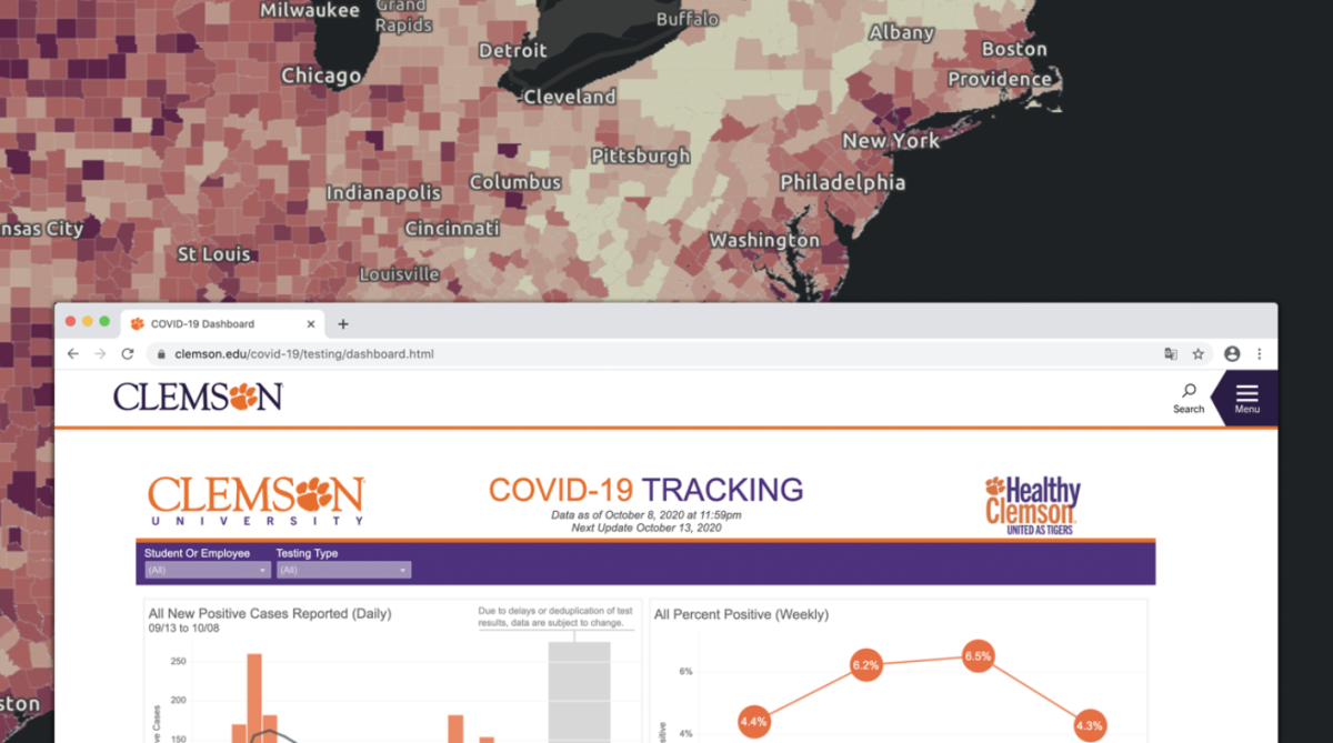
Clemson University, in an effort to control the spread of COVID-19, has followed in the footsteps of other universities nationwide by releasing a COVID-19 Tracking Dashboard. This dashboard has seen numerous iterations and updates since its early summer release; however, it continues to lack key data points that other Atlantic Coast Conference (ACC) universities and South Carolina institutions have.
The ACC, an athletic conference with fifteen participating universities, spreads along the east coast from New York to Florida. The east coast of the United States has seen some of the greatest burden of the COVID-19 pandemic, but the impact has varied by county and state due to different responses and regulations.
The Tiger News, in an effort to gauge Clemson University’s COVID-19 response as campus has reopened and positive cases grow, looked at the dashboards of other ACC schools– schools that share characteristics of size and funding but differ by region. Each data point that the dashboards share was recorded, as well as unique information that certain schools have chosen to share, in order to measure the effectiveness of the dashboard.
Clemson University’s COVID-19 positivity rate topped 6.5% the week of 09/27 to 10/03 with 8,681 tests performed. This previous week showed a decrease to 4.3% with 5,857 tests performed. Cumulatively, Clemson has a 6% positivity rate from all test results submitted since June.
This is one of the highest positivity rates, both in recent weeks and overall, of all ACC schools. Other universities such as Florida State University, N.C. State University and UNC Chapel Hill have reported cumulative positive rates higher than Clemson’s. However, no other university other than Virginia Tech, at 5.61%, has reported a weekly positive rate as high as Clemson’s in recent weeks.
The COVID-19 dashboard is one of Clemson’s responses to this expected surge in positive cases. However, there are contrasts between Clemson’s dashboard and the dashboards of other ACC universities, some of which have lower positivity rates.
One of the most notable contrasts is that of update frequency. Clemson is currently following a twice-per-week update schedule for the dashboard, which has varied between Tuesday and Thursday or Friday. Nine of the fifteen ACC universities are updating on a more frequent basis such as three times per week, daily, or even twice per day at the University of Miami.
The Tiger News spoke to Clemson University’s Director of Emergency Management, Sarah Custer, early last week about the dashboard. In response to a question regarding the update frequency of the dashboard, Custer signaled an effort to increase frequency to eventual daily updates.
“The goal is to move to daily updates. We started with weekly updates, but the data is currently being manually inputted for accuracy. We want an accurate picture [of what’s going on],” explained Custer. “There’s no ETA at the moment, but we’re working on it.”
When it comes to the data being presented, Clemson has held on par with other ACC universities. The percent positivity rate, cumulative results, number of students in isolation and a graphical presentation of the data are all characteristics that Clemson’s COVID-19 dashboard has that most other ACC schools do as well. A difference can be found in the isolation capacity of the university, meaning allocated quarantine space for on-campus residents.
Clemson University’s dashboard does not currently display this statistic; however, the Campus Opening Plan released in the beginning of September gave a number of 674 beds. Five other ACC schools, as well as the University of South Carolina, display the quarantine capacity- in either a percentage or numerical value.
Clemson’s dashboard update on Oct. 8 indicated that 289 beds were occupied by students in isolation. Custer, addressing the current capacity, occupation and any updates, indicated that it is a high priority for the university to increase this capacity, without confirming that the number has changed from 674.
A few universities have released unique information and data through their dashboards in the interest of spreading knowledge to hamper the spread of the virus. UNC Chapel Hill displays ‘clusters’ of positive cases in individual residence halls and communities, alongside the occupancy for those communities. Georgia Tech has individual analyses of campus impact for each positive case result, anonymously detailing the last time the individual was on campus and any affected parties.
In addition, most universities have maintained the historical data that they previously released on their dashboards going back to the beginning of the fall semester. Only Clemson and three other ACC schools have not provided this data. In response to this, Custer explained the university’s reasoning.
“Our focus is on clarity and key information that can be used to make risk-based decisions on an individual-to-individual basis,” explained Custer of the current dashboard’s data points. “Older versions of the dashboard were too cluttered and difficult to decipher.”
Addressing the current spread of COVID-19 on campus and the high positivity rate, The Tiger asked Custer if there were any additional efforts being taken to actively combat the rising statistic.
“We’re trying to cover all the bases and think outside of the box. Right now, we’re doing well in the state. We want to be lower, of course, and we’re focusing on our testing strategy to achieve that. But we’re doing well compared to [South Carolina] as a whole,” responded Custer.


